1. Do your homework!
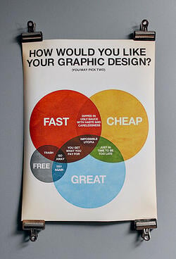
Before you approach your creative resource, make sure you know what your deliverables are and what is achievable within your timeframe. This will not only help you to map out your project, but it will also clearly define what needs to be created. Start gathering any source materials that would be helpful to your projects such as style guides, logos, and any native assets. Your creative resource can also be your consultant. Capitalize on their experience! They may have worked on other projects that can be leveraged, or spark new ideas that you didn’t even think of!
2. Be specific about your vision!
Many times in my career, I’ve had requests to make designs look “modern” or “scientific.” Terms like these can mean different things to different people. To help get you and your designer on the same page, it is helpful to give an idea of a general look and feel that is beyond these descriptors. This could be a link to a website, a logo, or even a TV show. Make it look “scientific” could mean Dexter’s laboratory or it could mean Star Trek, so giving a general visual cue will help get both you and your designer off to the right start.
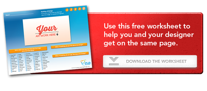
Download this free activity worksheet to help make sure you and your designer are on the same page!
3. Don’t worry, it’s just a draft!
Designers try, but we don’t hit it out of the park on the first swing every time. Use the first draft as a starting point. As you continue to refine your content, your designs may also continue to evolve. It’s also important to use constructive language when giving feedback. For instance, instead of saying “I don’t like the font,” you could say, “I think San serif fonts would work better for this project.” Being constructive and specific will help you and the designer arrive at the desired result more efficiently. When you work with a creative resource, the process will be a collaborative one, and in the end, it will hopefully mean that you and your designer will be happy with the results.
4. Who is the decision maker?
Make sure that you have clearly defined who will be the key point of contact. Most projects have a team of people that will be reviewing the designs—from many different points of view! This makes it very important for your design resource to have all comments and feedback consolidated by a key point of contact. You don’t want to put your designer in the crosshairs of conflicting opinions.
5. Say thank you!
A little bit goes a long way. Especially if your creative resources are in-house, make sure to thank them. They will be much more likely to go the extra mile for you the next time you knock on their door.
Kristin Butters is CLD’s in-house creative rock star and Art Director. She has over 15 years of experience creating dazzling graphics, interactivities, and animations for numerous training programs, first-in-class product launches, and learning systems. Click here to check out a small sampling of our animation and illustration offerings!


