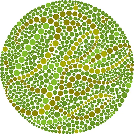
Color blindness (color vision deficiency or CVD) is not actually blindness, rather it is a deficiency in the way some people perceive color. According to colourblindawareness.org, 1 in 12 men and 1 in 200 women are colorblind. These numbers suggest that there is at least one color blind participant in each training class!
Color blindness is not the same for everyone; there are different forms and degrees of color deficiency. One person may find it difficult to distinguish shades of color and another may have an extreme case where they cannot see any colors at all. The most common form of color blindness is known as red/green color blindness, a less common form is blue color blindness, and seeing just black and white (monochromacy) is very rare.
People who are color blind can typically see things just as clearly as others but they have a harder time differentiating between colors, which can depend on the darkness, lightness, or shading of the coloration. For example, a red/green color blind person will often confuse blue and purple because they can’t ‘see’ the red tones of the color purple.
Image Credit: coca-colacompany.com
So what does this have to do with training?
It’s important to be aware of and sensitive to color vision deficiency when creating training materials. This applies to any type of materials you create including, eLearning, virtual training, or instructor-led programs. Here are some key points to keep in mind:
- Make sure that color is not the ONLY visual way to communicate information, indicate an action, solicit a response, or identify an element.
- Use a white or light background and dark fonts. Ideally, you want a contrast ratio of at least 4.5:1.
- Whenever possible, avoid the following color combinations that are difficult for people with color blindness to distinguish:
-
- Red and Green
- Yellow and Bright Green
- Light Blue and Pink
- Dark Blue and Violet
- When creating charts and graphs in training materials, make them easier to read by using:
- line charts with different styles (dashes, dots, solid, etc.) AND different colors
- bar or pie charts with different pattern fills AND different color
Just as trainers work with and adapt to learners with various learning styles, having empathy and understanding for those with color blindness will help you be a better leader. This link provides examples of what the color spectrums look like for those with varying levels of color blindness.
Color blindness can be frustrating, however, most adults are able to adapt to their situation. As trainers, we are already asking our learners to process what are often complex and complicated topics. Making conscious color choices in your training materials can make a world of difference for these adult learners who are simply trying to see what everyone else is seeing.


 Image Credit: coca-colacompany.com


